Sometimes More Is More
Painting with a Larger Palette
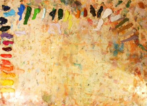
As many of you who have read my blog or taken my classes know I normally encourage students to use a limited palette of colors. As you become a more advanced painter it’s good to learn to use a more extensive collection of colors. Here I have over 32 colors. I use more primary and secondary colors to fill the spaces between the primary and secondary colors. I also use colors that have been lightened with white such as light yellow, light red or pink, light violet, light blues, light greens, and lightened orange. These colors will lean warmer or cooler versions of each primary and secondary color. I lay the colors out chromatically or the the way they progress around the color wheel. I then layout a collection of earth tones followed by a collection of neutrals and white and black. By using a combination of more variations of hues(example yellower orange red, orange red, primary red, red violet, blue red violet I have five different variations of red), Tints(colors mixed with white), shades(darker colors mixed with either black or burnt umber example Paynes Gray is a dark grayed blue made from mixing Phalo blue with Burnt umber), grayed colors(colors with lowered intensity I use grays that lean red,blue,yellow,orange, green and violet and are very neutral. Mixing these with colors can be a quick way of lowering intensity), Browns( darkened yellows, reds and oranges these are great colors to warm dark color mixtures) these give me chances to use more sophisticated color mixing methods and create a wider range of colors.
A wider range of colors is a good thing to help achieve those nuances of hue and chroma. The downside is you have more opportunities to put the wrong colors together which will destroy your color structure. A limited palette of colors helps to control the color structure. The reason is because most all of your mixed colors have combinations of all of the primary colors in their mixtures. Because each mixed color has a combination of the primary colors the is an immediate color harmony. You are also limiting your ability to mix many color that are artificial and will never be seen in nature like neon colors or colors and others. You want the added benefits of an unlimited color palette but not the downside of making too many color mistakes that will destroy your painting. So how do you control your color structure and your color mixtures?
Answer: Use a “color unifying method” there are three common methods of controlling color mixtures. Use on of the three listed below.
A. Use a unifying color such as brown. The classic artists used this method all the time and still do today. With this method every mixture has a little brown in it. Say Burnt Umber, you would add this color to everyone of your color mixtures.
B. Use three primary colors (red, yellow and blue) in every color mixture.
C. Always mix two complimentary colors in every mixture (example primary color mixed with complimentary secondary color, or two complimentary tertiary colors.
Using these methods will help you from having your color mixtures from becoming a complete mess. You will need to pay special attention to you color relationships to keep them clear another words if your warm colors are in the shadows than make sure all your light families of colors are leaning to the cool side of the color wheel. This approaches will help you control your color mixtures and paintings.
Example of My Unlimited Color Palette
I use Pretested-Grumbacher, Gamblin, M Graham or Winsor Newton Paints. Here are my colors. I don’t always use all these colors but this is an example of my unlimited oil colors.
Yellows
Naples Yellow(mixed, Cad yellow deep + white)
Cadmium Yellow Lemon
Cadmium Yellow Medium
Cadmium Yellow Deep
Indian Yellow
Yellow Ochre
Raw Sienna
Oranges
Cadmium Orange
Orange Light( mixed, Cadmium Orange + White)
Burnt Umber
Reds
Light Pink(mixed Cad Red Light + White)
Cadmium Red Lt.
Cadmium Red Medium
Cadmium Red Deep
Alizarin Crimson
Thalo Rose
Burnt Sienna
Violet
Thalo Violet
Dioxine Purple
Light Purple(mixed, Dioxine Purple + White)
Blues
Cobalt Blue
Thalo Blue
French Ultramarine Blue
Light Blue Warm (mixed, Thalo Blue + White)
Light Blue Cool (mixed, Ultramarine Blue + White)
Paynes Gray
Greens
Green Light Cool(mixed, Phalo Green + white)
Green Light Warm (mixed, Sap Green + Cadmium Yellow Medium+ White)
Viridian
Olive Green (mixed, Sap Green + Cadmium Orange)
Sap Green
Thalo Green
Grays
Mixed grays(whatever suits me at the time)
Other Colors
Titanium White
Ivory Black
I’ve had a studio in downtown Roanoke va for 34 years. Lately I’ve found I can coax just about ant colors I need from a palette of cad orange, Payne’s Gray , and white. Only limitations would be bright yellows. I’ve found this palette is good for portraits as well as landscapes. Your thoughts on this.
Sounds like an interesting palette. I am glad it’s working so well for you.